
I was reminded of Ork Posters, which illustrates cities according to neighborhoods (see Manhattan, left)
by the very cool and quite humorous New York Times OpEd Smell Map by Jason Logan, which profiles manhattan according to summer smells (check it out if you havent seen it yet).
I made me think of several other interesting maps that I have seen recently and how they all represent cool ways to see familiar places.
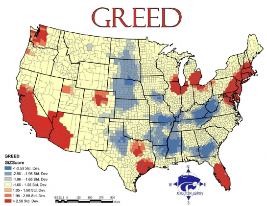
Most recently, OneFloorUp introduced me to the Seven Deadly Sins Map- our nation mapped according to each of the sins (ahem, Greed featured below):
…which reminded me of a Social Explorers Interactive Demographic Map that I saw a couple years ago that demonstrated demographic changes in the country and NYC region according to census information. An interactive map, visit the site to experience!
…which reminded me of a post I saw on Oh Joy! About Famille Summerbelle’s paper cut out maps of London and Paris (pictured below)
…which reminded me of a post I saw on Oh Joy! About Famille Summerbelle’s paper cut out maps of London and Paris (pictured below)

…which all reminded me of the more practical (read: less pretty but waterproof & easier to manage – no crumpling) Fabric Rand McNally maps that I recently read about in The Week Magazine.


No comments:
Post a Comment